Chapter 16 ggplot solution
First let us load the libraries we will need:
library(readr)
library(dplyr)
library(ggplot2)
library(magrittr)
##
## Attaching package: 'magrittr'## The following object is masked from 'package:tidyr':
##
## extract## The following object is masked from 'package:purrr':
##
## set_namesLet’s get started!
16.1 Load Data and Clean variable names
16.1.1 1. Load the data from the file data/EconomistData.csv.
df <- read_csv("data/EconomistData.csv")## Rows: 173 Columns: 5## ── Column specification ────────────────────────────────────────────────────────
## Delimiter: ","
## chr (2): Country, Region
## dbl (3): HDI.Rank, HDI, CPI##
## ℹ Use `spec()` to retrieve the full column specification for this data.
## ℹ Specify the column types or set `show_col_types = FALSE` to quiet this message.glimpse(df)## Rows: 173
## Columns: 5
## $ Country <chr> "Afghanistan", "Albania", "Algeria", "Angola", "Argentina", "…
## $ HDI.Rank <dbl> 172, 70, 96, 148, 45, 86, 2, 19, 91, 53, 42, 146, 47, 65, 18,…
## $ HDI <dbl> 0.398, 0.739, 0.698, 0.486, 0.797, 0.716, 0.929, 0.885, 0.700…
## $ CPI <dbl> 1.5, 3.1, 2.9, 2.0, 3.0, 2.6, 8.8, 7.8, 2.4, 7.3, 5.1, 2.7, 7…
## $ Region <chr> "Asia Pacific", "East EU Cemt Asia", "MENA", "SSA", "Americas…16.1.2 2. Convert all columns names to snakecase (i.e. my_variable)
library(janitor)##
## Attaching package: 'janitor'## The following objects are masked from 'package:stats':
##
## chisq.test, fisher.testdf %<>% clean_names("snake")16.2 One Variable Graphs
First we work with some single variable plots.
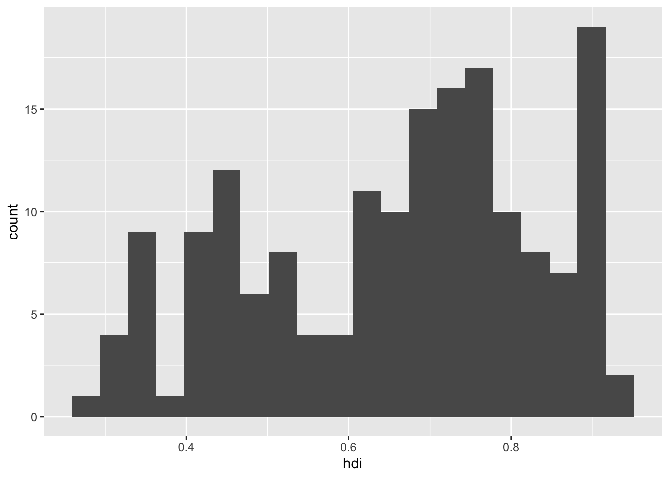
16.2.1 1. Create a histogram of the human development index. Customize the number of bins to make the plot look nicer than the default.
df %>%
  ggplot() +
  geom_histogram(aes(hdi),
                 bins = 20
                 )
16.2.2 2. Instead of a histogram, create a density plot of the HDI. Extend your plot by:
16.2.3 (a) In one graph plotting the densities by region.
df %>%
  ggplot(aes(cpi, fill = region)) +
  geom_density()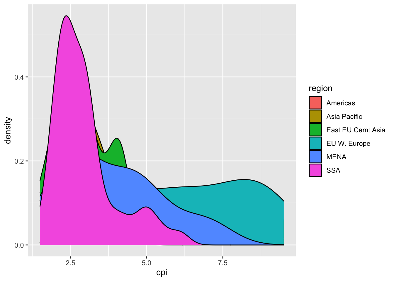
16.2.4 (b) Creating separate plots per region, with the area under the density to be coloured blue.
df %>%
  ggplot(aes(hdi)) +
  geom_density(fill = "blue") +
  facet_wrap(vars(region), ncol = 2)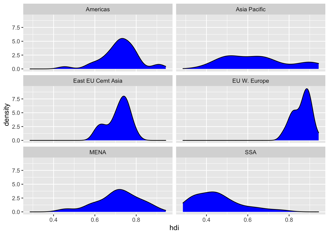
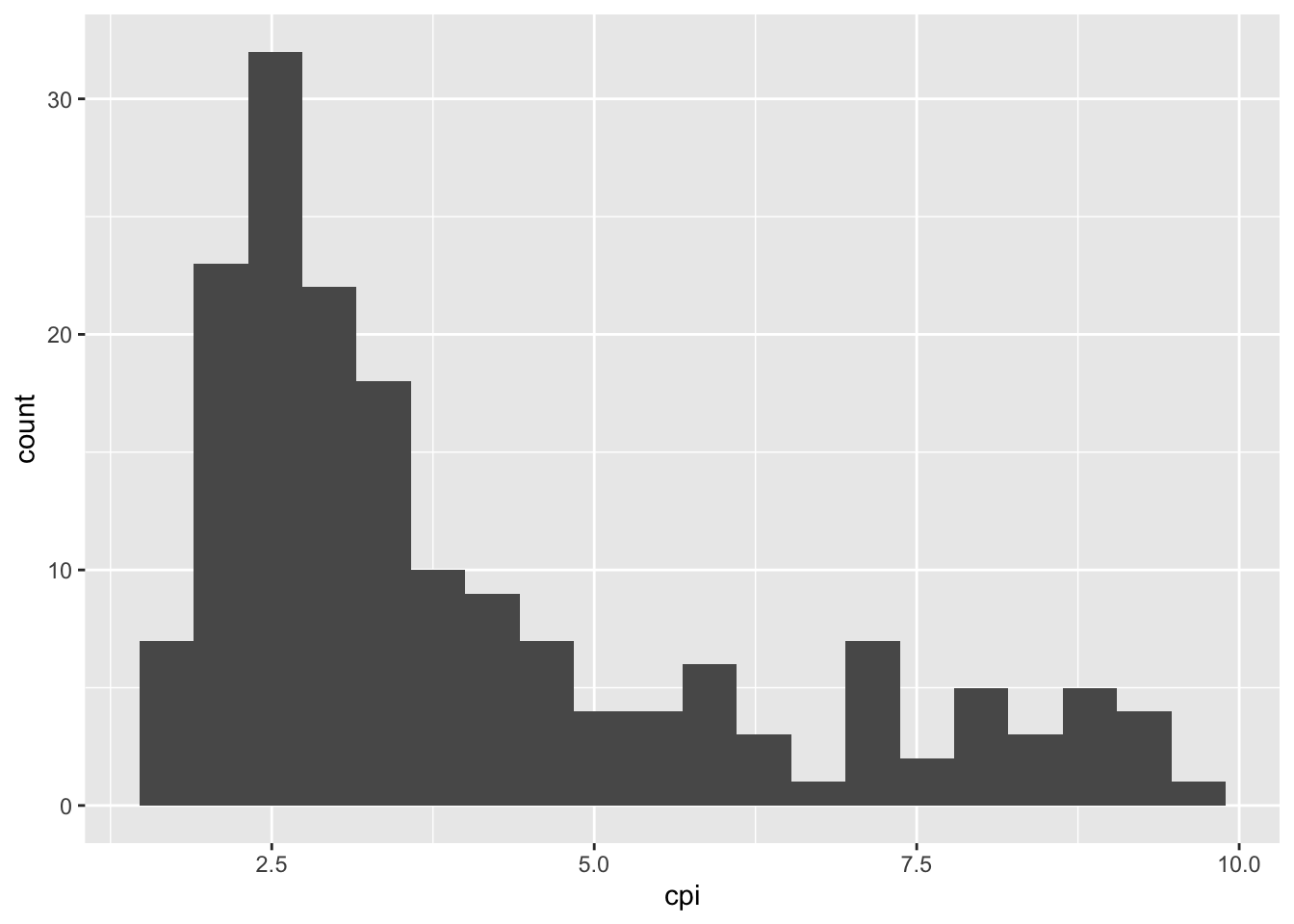
16.2.5 (c) Repeat (1) and (2) for the corruption perception index.
df %>%
  ggplot() +
  geom_histogram(aes(cpi),
                 bins = 20
  )
df %>%
  ggplot(aes(cpi)) +
  geom_density(fill = "blue") +
  facet_wrap(vars(region), ncol = 2)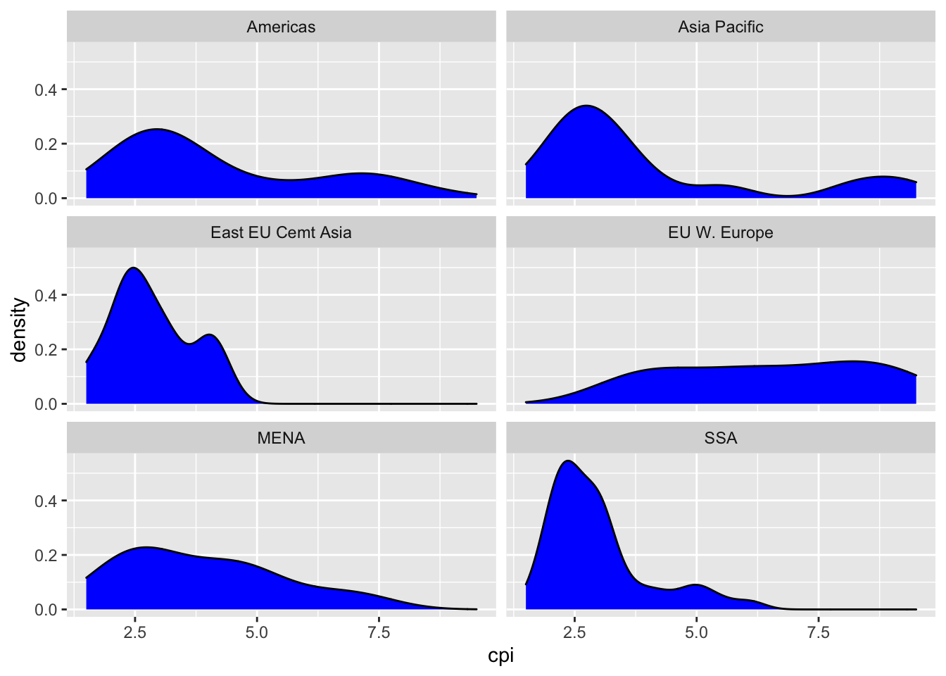
16.3 Two Variable Graphs
Now we are going to build up a ‘pretty’ graph that plots the corruption index (along the x-axis) against the human development index (along the y-axis).
16.3.1 1. Create the simple scatter plot
df %>%
  ggplot(aes(x = cpi, y = hdi)) +
  geom_point()
16.3.2 2. Let’s extend the plot in different ways. Modify the plot to (each point should be a different plot)
16.3.3 a. Make the points blue
df %>%
  ggplot(aes(x = cpi, y = hdi)) +
  geom_point(color = "blue")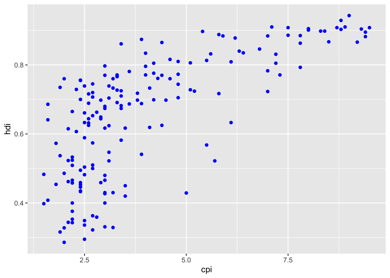
16.3.4 b. Color the points by region
df %>%
  ggplot(aes(x = cpi, y = hdi)) +
  geom_point(aes(color = region))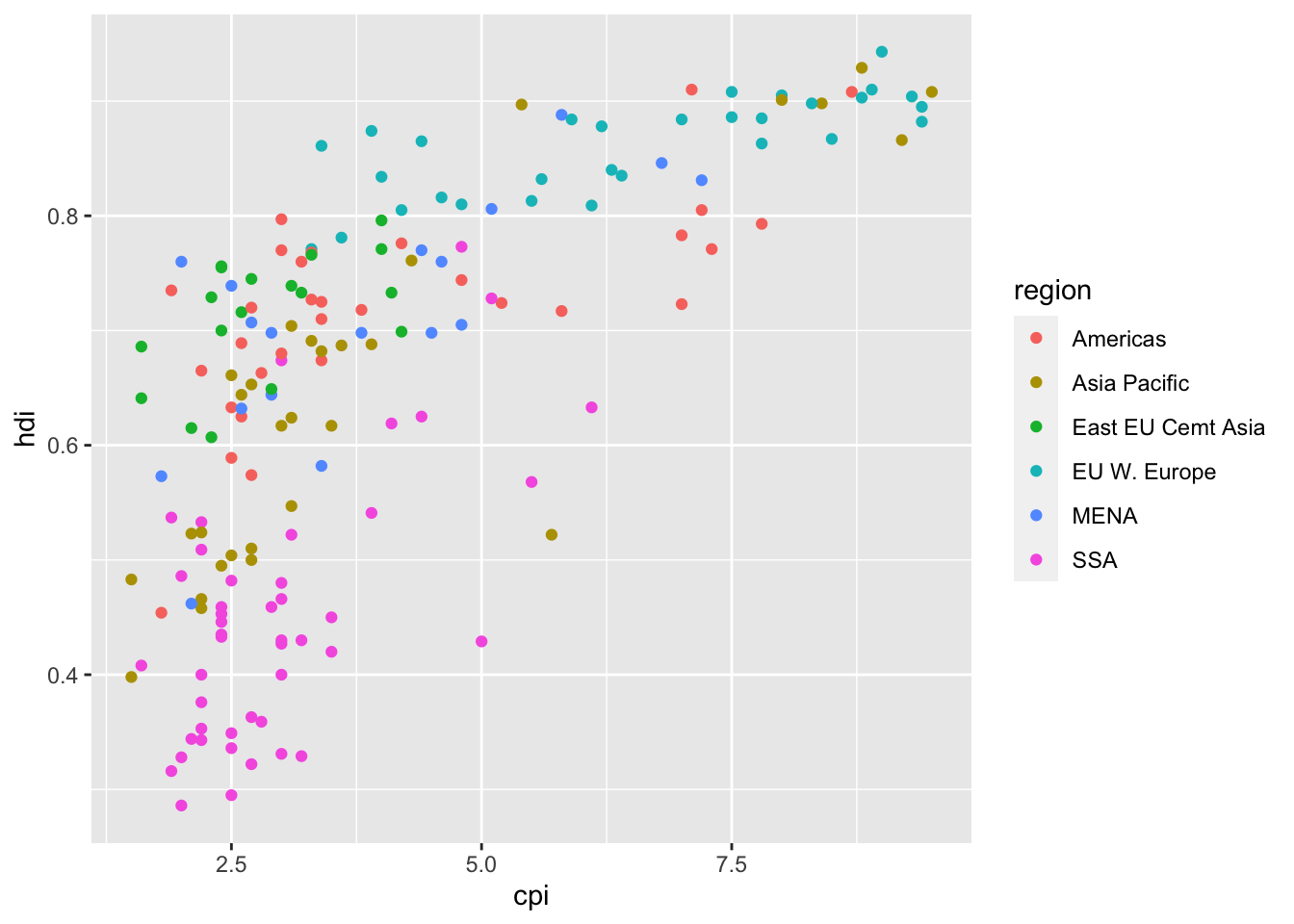
16.3.5 c. Color the points by region and make the size of the point vary by HDI.
df %>%
  ggplot(aes(x = cpi, y = hdi)) +
  geom_point(aes(color = region, size = hdi ))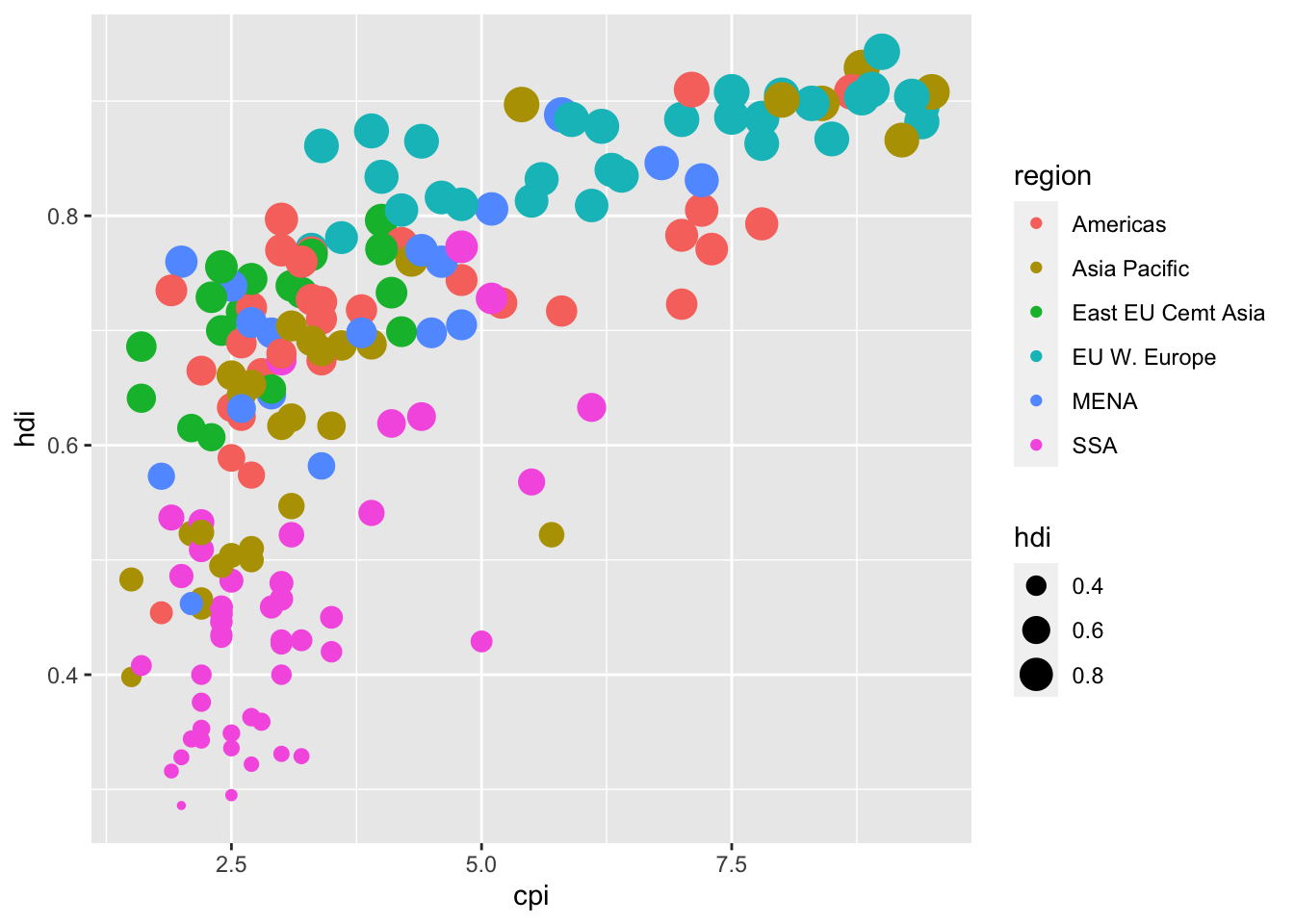
16.3.6 3. Let’s extend the plot in (1) by adding some summary functions to it.
16.3.7 a. Add a loess smoother
df %>%
  ggplot(aes(x = cpi, y = hdi)) +
  geom_point() +
  geom_smooth()
## `geom_smooth()` using method = 'loess' and formula 'y ~ x'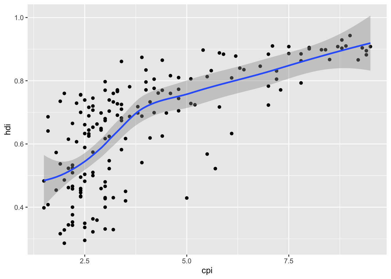
16.3.8 b. Add a linear smoother, without the confidence interval. Color the line red.
df %>%
  ggplot(aes(x = cpi, y = hdi)) +
  geom_point() +
  geom_smooth(se= FALSE, method = "lm", color = "red")
## `geom_smooth()` using formula 'y ~ x'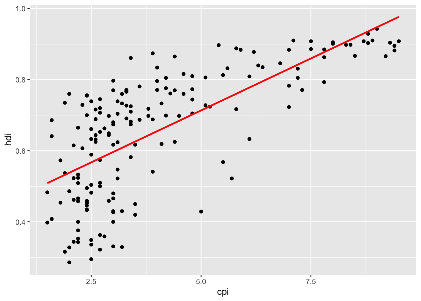
16.3.9 c. Add the line y ~ x + log(x), without the confidence interval. Color the line red.
df %>%
  ggplot(aes(x = cpi, y = hdi)) +
  geom_point(aes(color = region, size = hdi )) +
  geom_smooth(se= FALSE,
              method = "lm",
              formula = y ~ x + log(x),
color = "red") 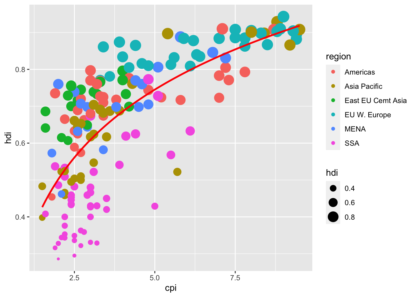
16.3.10 4. Now we will add the country names to the plot from (1).
For this we will need the package ggrepel because it makes this process easier.
Install the package ggrepel. Use the function geom_text_repel
library(ggrepel)16.3.11 a. Use geom_text() to add country names to our plot.
df %>%
  ggplot(aes(x = cpi, y = hdi)) +
  geom_point(aes(color = region),
             shape = 1, size = 2.5, stroke = 1.25) +
  geom_smooth(se= FALSE,
              method = "lm",
              formula = y ~ x + log(x),
              color = "red")  +
  geom_text_repel(aes(label = country))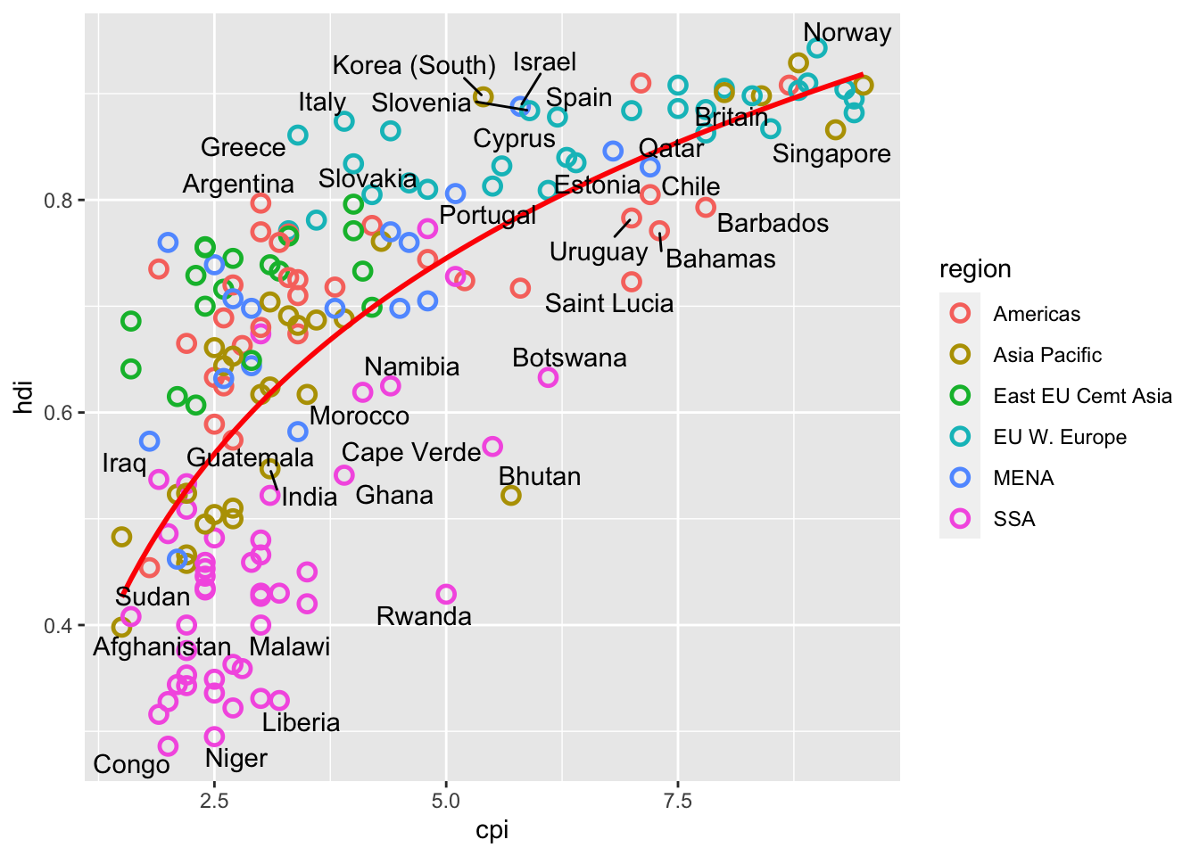
16.3.12 b. We might not want all the points labelled. Create the vector
points_to_label <- c("Russia", "Venezuela", "Iraq", "Myanmar", "Sudan",
               "Afghanistan", "Congo", "Greece", "Argentina", "Brazil",
               "India", "Italy", "China", "South Africa", "Spane",
               "Botswana", "Cape Verde", "Bhutan", "Rwanda", "France",
               "United States", "Germany", "Britain", "Barbados", "Norway", "Japan",
               "New Zealand", "Singapore")
Now adjust the code in (a) to only label these pointsdf %>%
ggplot(aes(x = cpi, y = hdi)) +
geom_point(aes(color = region),
shape = 1, size = 2.5, stroke = 1.25) +
geom_smooth(se= FALSE,
method = "lm",
formula = y ~ x + log(x),
color = "red") +
geom_text_repel(aes(label = country),
color = "gray20",
data = filter(df, country %in% points_to_label),
force = 10)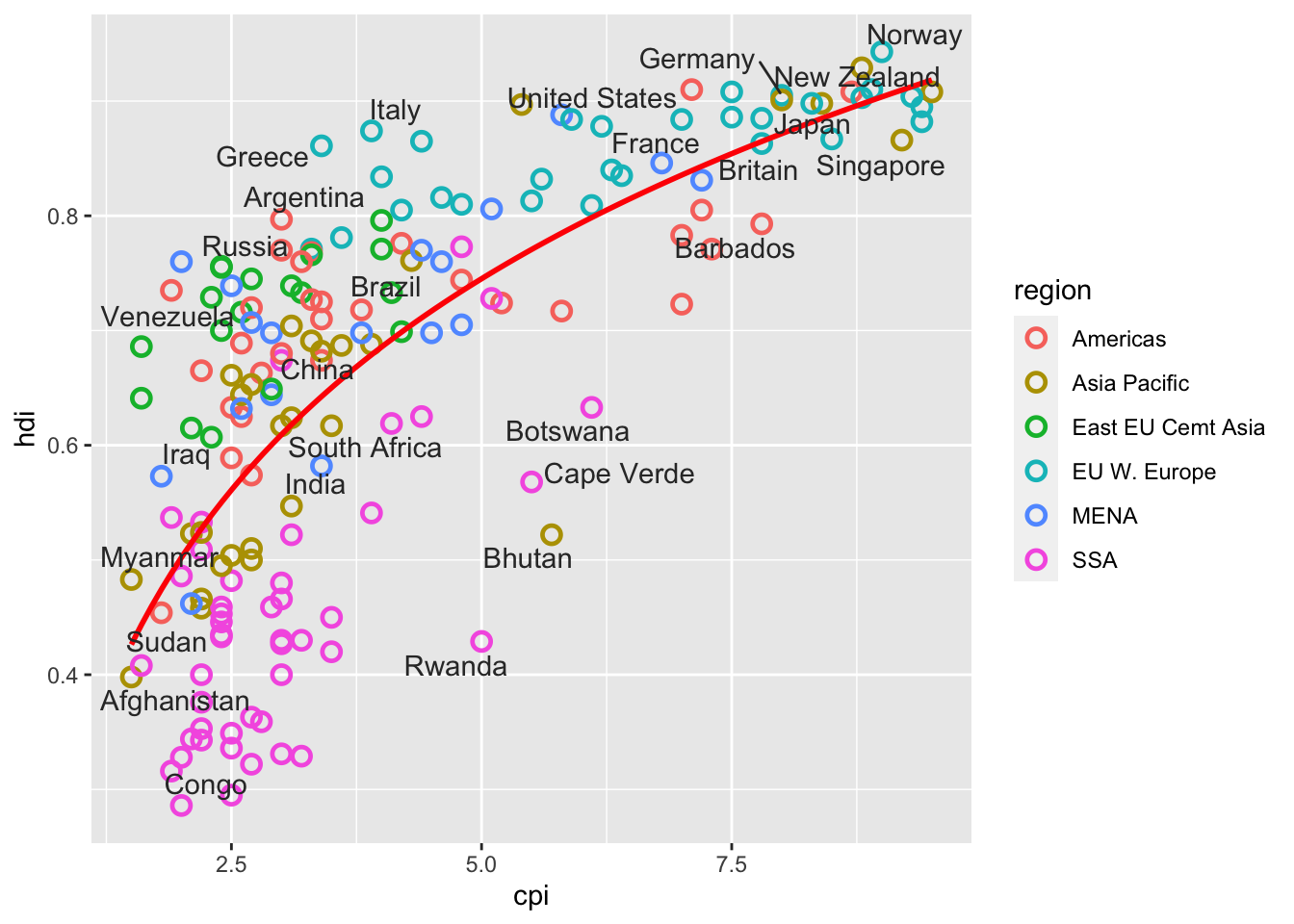
16.3.13 5. Now let’s combine what we learned above, and from the class notes to build up a presentable notes. Proceed as follows:
16.3.14 a. Create the simple scatter plot
df %>%
  ggplot(aes(x = cpi, y = hdi)) +
  geom_point()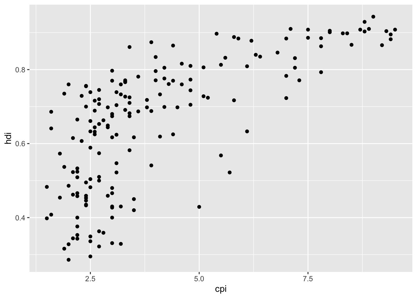
16.3.15 b. Make the points hollow, and colored by region. Adjust the size of the dots to make them easier to see.
df %>%
  ggplot(aes(x = cpi, y = hdi)) +
  geom_point(aes(color = region),
             shape = 1, size = 2.5, stroke = 1.25)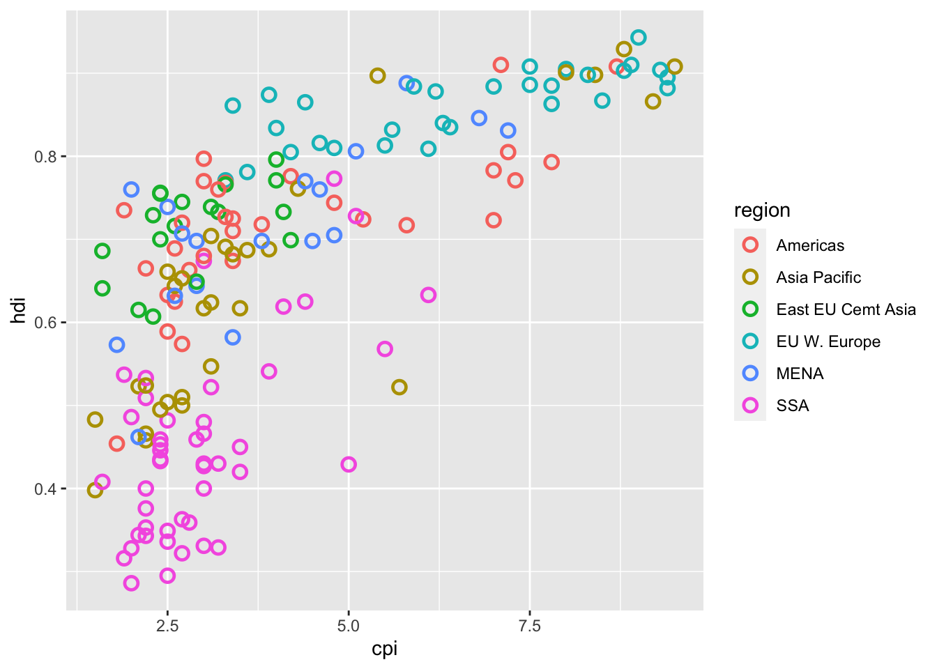
16.3.16 c. Add the line y ~ x + log(x), without the confidence interval. Color the line red.
df %>%
  ggplot(aes(x = cpi, y = hdi)) +
  geom_point(aes(color = region),
             shape = 1, size = 2.5, stroke = 1.25) +
  geom_smooth(se= FALSE,
              method = "lm",
              formula = y ~ x + log(x),
color = "red") 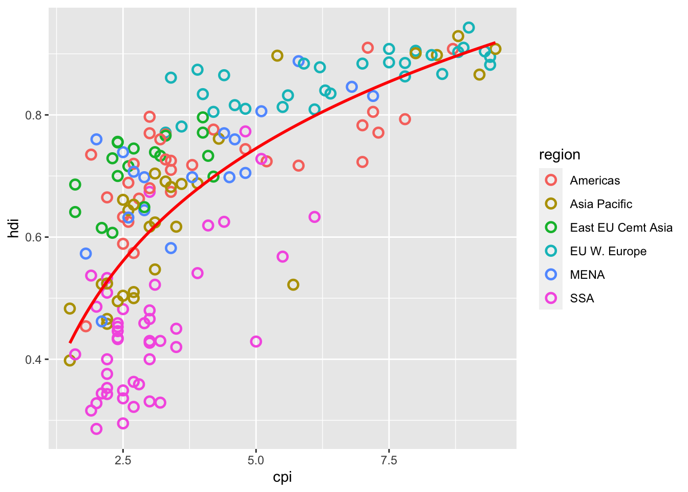
16.3.17 d. Change the color of the dots to be less ugly. I used scale_color_manual() but you don’t need to.
df %>%
  ggplot(aes(x = cpi, y = hdi)) +
  geom_point(aes(color = region),
             shape = 1, size = 2.5, stroke = 1.25) +
  geom_smooth(se= FALSE,
              method = "lm",
              formula = y ~ x + log(x),
              color = "red") +
 scale_color_manual(name = "",
                     values = c("#24576D",
                                "#099DD7",
                                "#28AADC",
                                "#248E84",
                                "#F2583F",
                                "#96503F"))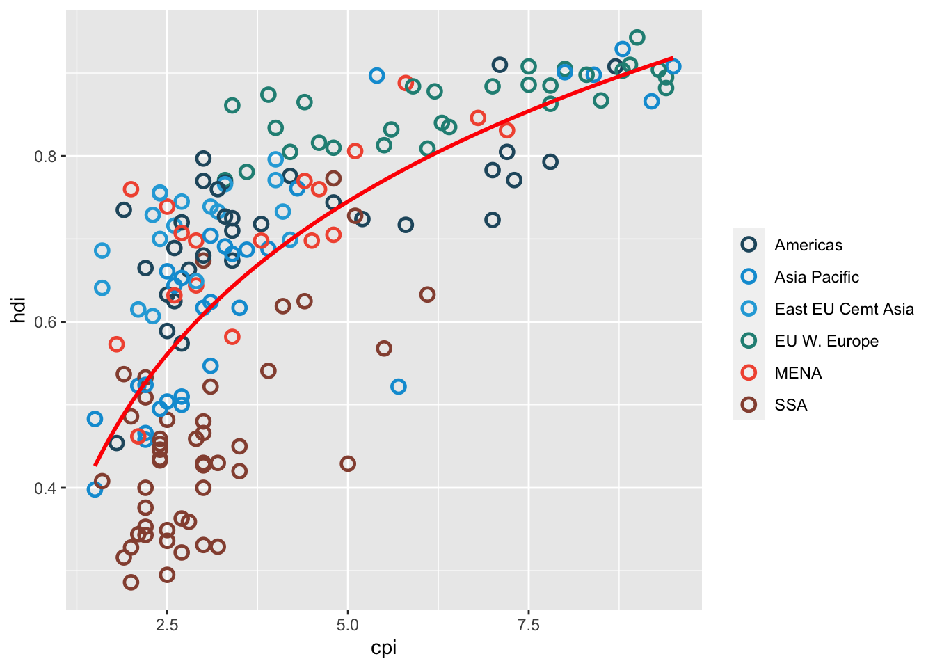
16.3.18 e. Add meaningful x and y labels. And a title (which is centered). Can you add a note near the bottom of the figure to say that the data comes from “Transparency International and UN Human Development Report”?
df %>%
  ggplot(aes(x = cpi, y = hdi)) +
  geom_point(aes(color = region),
             shape = 1, size = 2.5, stroke = 1.25) +
  geom_smooth(se= FALSE,
              method = "lm",
              formula = y ~ x + log(x),
              color = "red") +
 scale_color_manual(name = "",
                     values = c("#24576D",
                                "#099DD7",
                                "#28AADC",
                                "#248E84",
                                "#F2583F",
                                "#96503F")
                    ) +
  theme_bw() +
  theme(legend.position = "bottom",
        plot.title = element_text(hjust = 0.5)) +
  xlab("Corruption Perceptions Index, 2011 (10=least corrupt)") +
  ylab("Human Development Index, 2011 (1=Best)") +
  ggtitle("Corruption and Human development", subtitle = waiver()) +
   labs(caption="Sources: Transparency International; UN Human Development Report")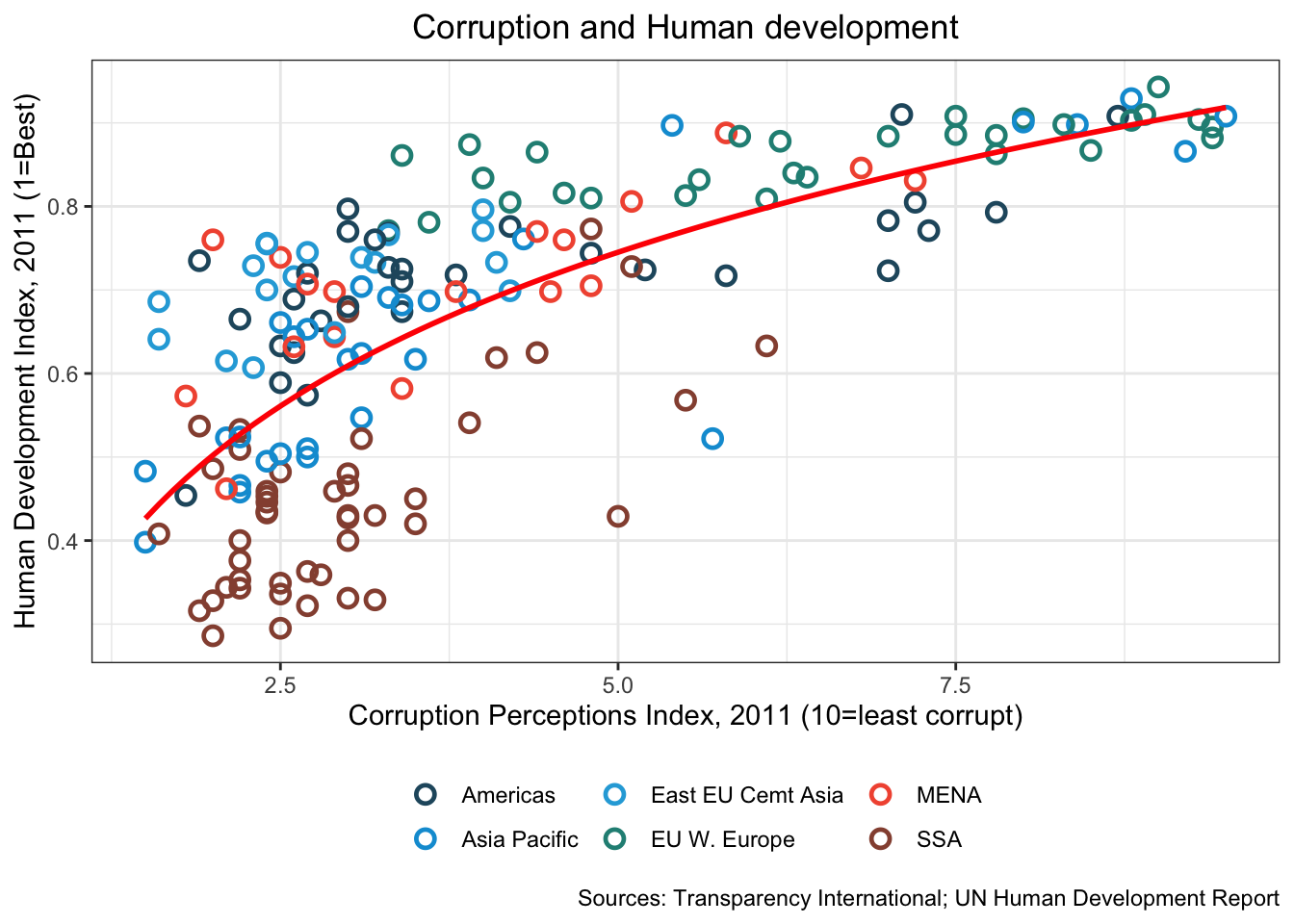
16.3.19 f. Label the points from points_to_label in 4b.
df %>%
  ggplot(aes(x = cpi, y = hdi)) +
  geom_point(aes(color = region),
             shape = 1, size = 2.5, stroke = 1.25) +
  geom_smooth(se= FALSE,
              method = "lm",
              formula = y ~ x + log(x),
              color = "red") +
 scale_color_manual(name = "",
                     values = c("#24576D",
                                "#099DD7",
                                "#28AADC",
                                "#248E84",
                                "#F2583F",
                                "#96503F")
                    ) +
    geom_text_repel(aes(label = country),
                color = "gray20",
                data = filter(df, country %in% points_to_label),
                force = 10) +
  theme_bw() +
  theme(legend.position = "bottom",
        plot.title = element_text(hjust = 0.5)) +
  xlab("Corruption Perceptions Index, 2011 (10=least corrupt)") +
  ylab("Human Development Index, 2011 (1=Best)") +
  ggtitle("Corruption and Human development", subtitle = waiver()) +
   labs(caption="Sources: Transparency International; UN Human Development Report")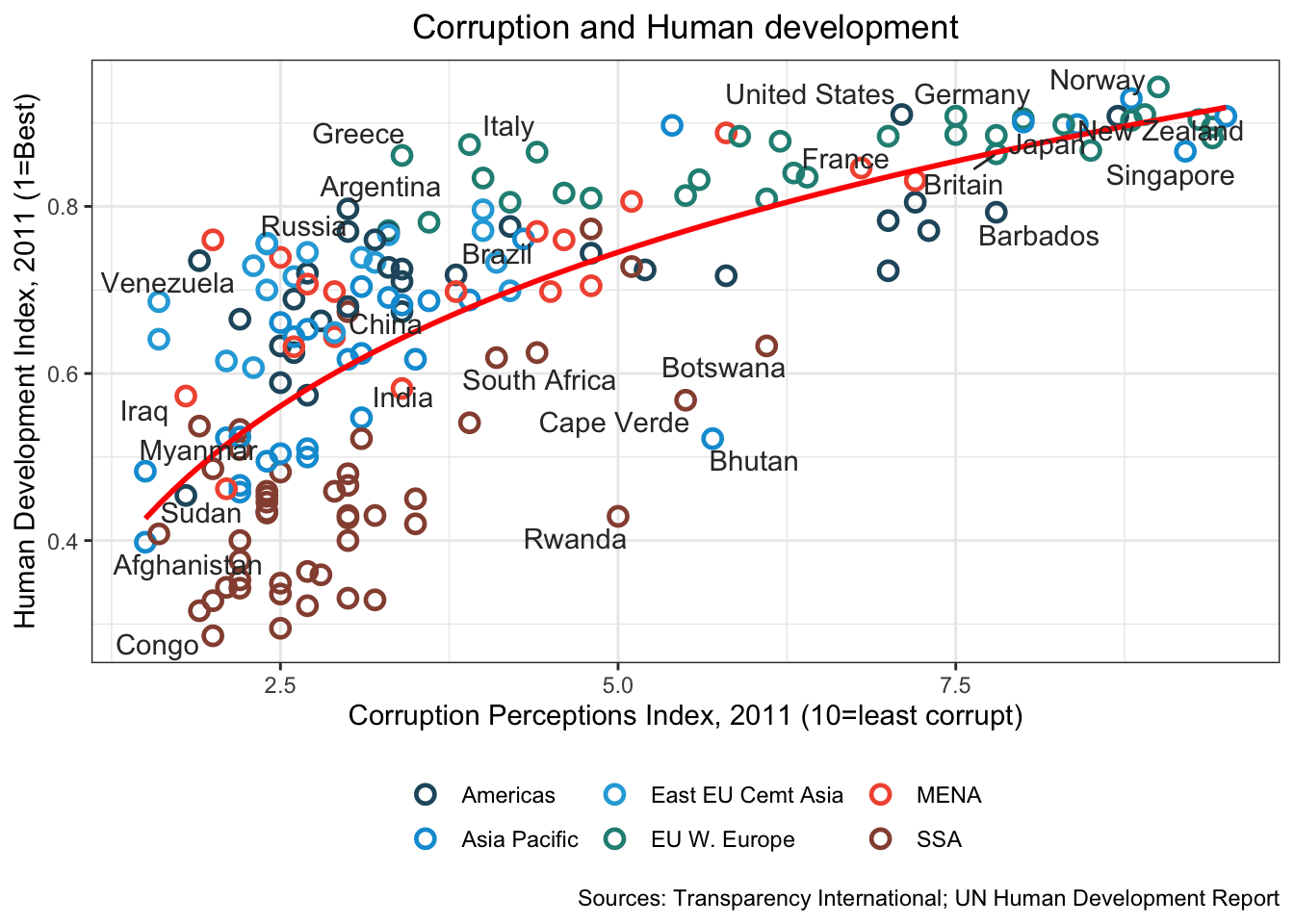
16.3.20 g. Adjust the x and y axes to have a better range, and set of axis ticks. You are free to choose what you like.
df %>%
  ggplot(aes(x = cpi, y = hdi)) +
  geom_point(aes(color = region),
             shape = 1, size = 2.5, stroke = 1.25) +
  geom_smooth(se= FALSE,
              method = "lm",
              formula = y ~ x + log(x),
              color = "red") +
 scale_color_manual(name = "",
                     values = c("#24576D",
                                "#099DD7",
                                "#28AADC",
                                "#248E84",
                                "#F2583F",
                                "#96503F")
                    ) +
    geom_text_repel(aes(label = country),
                color = "gray20",
                data = filter(df, country %in% points_to_label),
                force = 10) +
   scale_x_continuous(
    limits = c(.9, 10.5),
    breaks = 1:10) +
  scale_y_continuous(
    limits = c(0.2, 1.0),
    breaks = seq(0.2, 1.0, by = 0.1)
  ) +
  theme_bw() +
  theme(legend.position = "bottom",
        plot.title = element_text(hjust = 0.5)) +
  xlab("Corruption Perceptions Index, 2011 (10=least corrupt)") +
  ylab("Human Development Index, 2011 (1=Best)") +
  ggtitle("Corruption and Human development", subtitle = waiver()) +
   labs(caption="Sources: Transparency International; UN Human Development Report")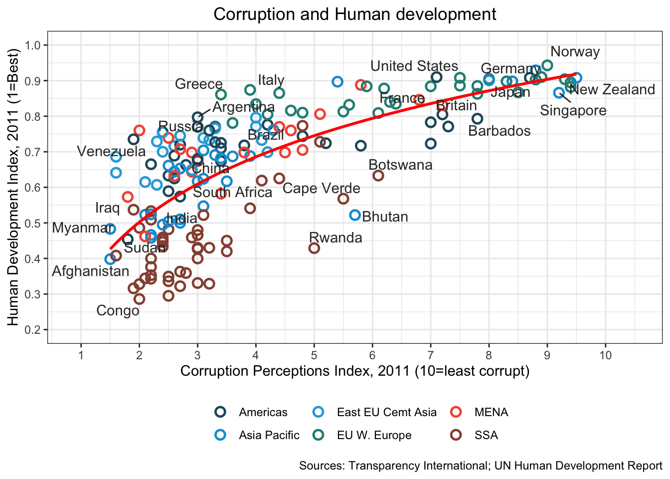
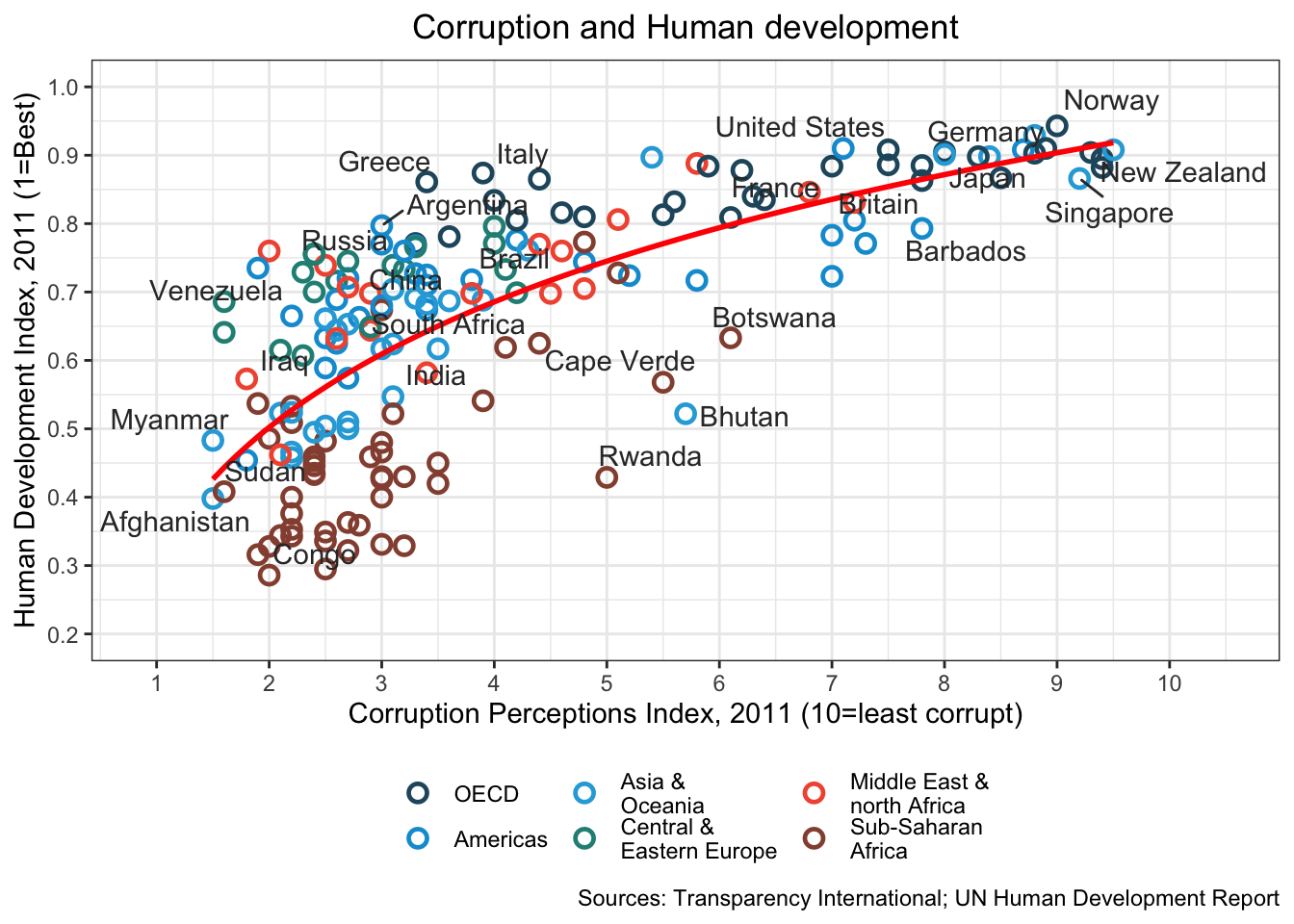
16.3.21 h. Move the legend to the bottom of the plot. Adjust the legend names so that they are easier to read and more meaningful. The easiest way to do this is to use dplyr to recode the region variable as a factor, and give it appropriate labels. Using the help menu for factor should help you here.
df2 <- df %>%
  mutate(region = factor(region,
                     levels = c("EU W. Europe",
                                "Americas",
                                "Asia Pacific",
                                "East EU Cemt Asia",
                                "MENA",
                                "SSA"),
                     labels = c("OECD",
                                "Americas",
                                "Asia &\nOceania",
                                "Central &\nEastern Europe",
                                "Middle East &\nnorth Africa",
                                "Sub-Saharan\nAfrica")
                     )
        )

df2 %>%
  ggplot(aes(x = cpi, y = hdi)) +
  geom_point(aes(color = region),
             shape = 1, size = 2.5, stroke = 1.25) +
  geom_smooth(se= FALSE,
              method = "lm",
              formula = y ~ x + log(x),
              color = "red")  +
  geom_text_repel(aes(label = country),
                color = "gray20",
                data = filter(df, country %in% points_to_label),
                force = 10) +
  scale_color_manual(name = "",
                     values = c("#24576D",
                                "#099DD7",
                                "#28AADC",
                                "#248E84",
                                "#F2583F",
                                "#96503F")) +
  theme_bw() +
  theme(legend.position = "bottom",
        plot.title = element_text(hjust = 0.5)) +
  xlab("Corruption Perceptions Index, 2011 (10=least corrupt)") +
  ylab("Human Development Index, 2011 (1=Best)") +
  ggtitle("Corruption and Human development", subtitle = waiver()) +
  scale_x_continuous(
    limits = c(.9, 10.5),
    breaks = 1:10) +
  scale_y_continuous(
    limits = c(0.2, 1.0),
    breaks = seq(0.2, 1.0, by = 0.1)
  ) +
  labs(caption="Sources: Transparency International; UN Human Development Report")